

Chipolo: A lovable
smart-tech brand
.jpg)
Smart technology
CHALLENGE:
Evolving a successful Kickstarter product into a globally recognisable brand.
SCOPE:
Brand strategy · Creative direction · Visual identity · Packaging · Website
ROLE:
Creative Director & long-term brand partner (2016–present)
IMPACT:
Built a distinctive brand presence that supported global partnerships and collaborations.
A brand with heart in a tech-driven category
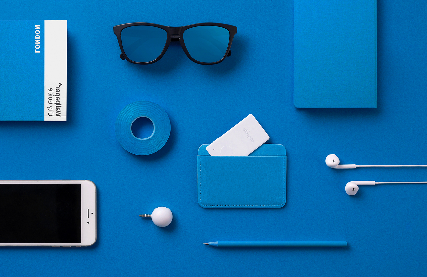
Chipolo was founded in 2013 with a simple mission: helping people find what matters to them. Its colourful item finders stood out in a category dominated by cold, black-and-white devices, bringing a more human and emotional approach to everyday technology.
As the company gained traction and expanded globally, the challenge shifted from proving the product worked to building a brand that could grow with it.
A good product isn't enough
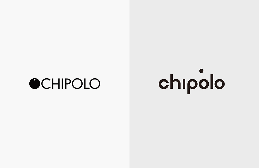
When I joined Chipolo in 2016, the company had already proven there was demand for its product. The next challenge was different: turning a successful startup into a brand people would recognise, trust and remember. We started by refining the visual identity, but it quickly became clear that what the company needed wasn't just better design. Chipolo needed a stronger brand.
Over the following years, I served as Chipolo's Creative Director, working alongside the team to shape the brand as it evolved.
The following case study shows how the brand evolved over the years through strategy, design and long-term creative direction.
Slowing down on purpose
Instead of kicking it off with visuals, we made a conscious decision to listen first. There was limited understanding of customers beyond assumptions. And a growing gap between how the team felt about the brand and how it showed up in the market.
Together with the team, we ran the company’s first-ever:
- Customer research
- Brand strategy workshops
I also interviewed every single person in the company: engineers, support teams, leadership. The goal was to understand how Chipolo saw itself, what mattered emotionally to its users, and where the brand wanted to grow — before making any creative decisions.
Arriving to clarity
Through these conversations, Chipolo’s early anchors became clear:
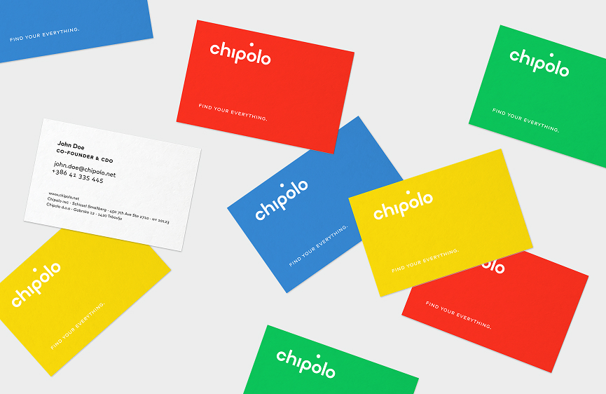
- Bold colour as a signal of warmth and passion in a cold category
- Emotional usefulness, not just functional utility
- A friendly, human tone of voice grounded in real life
After a year of shared exploration, a new, clearer identity emerged. The refreshed brand celebrated Chipolo's bold signature colours as a strategic asset, strengthened recognisability, and built trust through a clearer, friendlier website. It also began telling stories through lifestyle imagery and earned recognition within the design community.
This phase laid the foundation. But the real work happens over time, with careful implementation. All these ideas were expressed through art direction, design and overall communication.
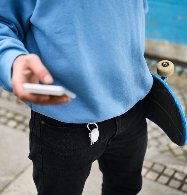
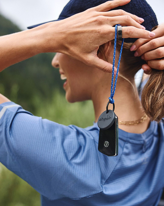
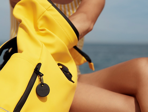
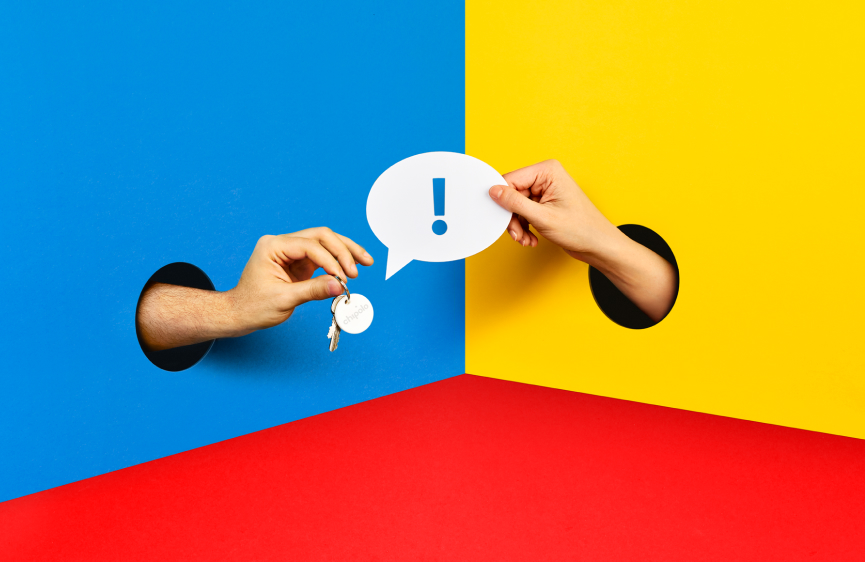
We adjusted the imagery and focused on the active lifestyle: filming and picturing active moments in nature and on the road, focusing on everywhere Chipolo can help you locate your missing items.
Brand Building is a process, not a project
Strong brands aren’t built by individuals. They’re built by aligned teams over time with executives that understand a strategy-first approach. The brand strategy definition process was repeated in a few years, as I’ve returned to the company as Creative Director. Since the company has grown considerably, we dived even deeper. Together with Chipolo’s executive team, we redefined:
- Values
- Mission and vision
- Chipolo’s “only-ness” in the market
UNDERSTANING CUSTOMERS
We introduced ongoing user research and an internal cultural survey to better understand not just customers, but the people behind the brand. Chipolo was once again reimagined; it grew into an ‘active lifestyle’ colorful brand to help with differentiation n the increasingly saturated market.
With the marketing team, we worked on the company’s story and tone of voice. The result was the new Chipolo Brand Playbook — a practical, working document that guides decisions across teams, partners, and communication. Along with it, a new Design System was created.
Turning a milestone into a smart brand experience
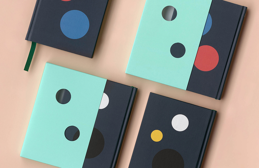
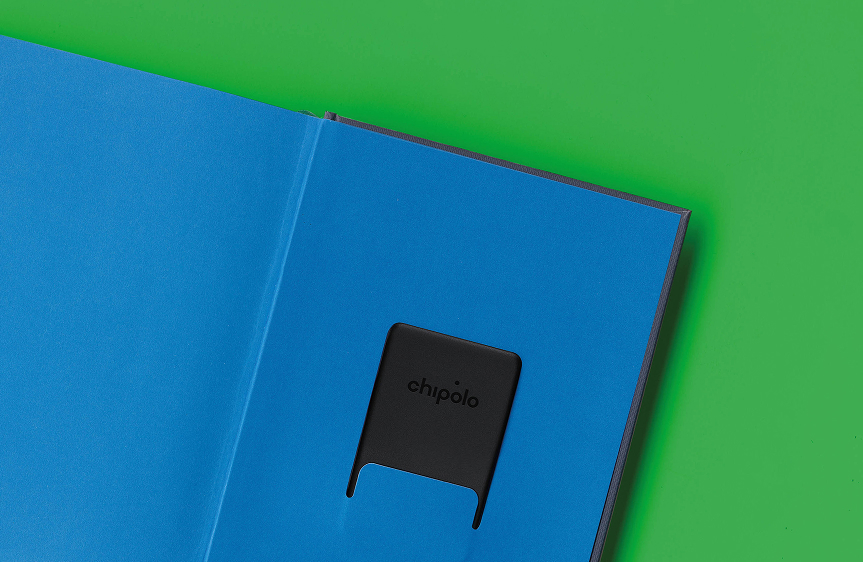
In between all these activities, the company reached one of its milestones. Chipolo marked its 10-year anniversary with a practical gift: a notebook filled with stories that illustrate the company culture.
By inserting the Chipolo CARD into the back pocket, the notebook becomes a smart object that you can track with your phone.
Systems that empower
Growing companies need systems, which help teams move faster without losing coherence. When brands grow, the amount of outputs grow with it. Having alignment and also clear rules around tone of voice, visual feeling, ads, visual communication etc. help teams work faster with unified results.
To help design team work better, the modular Design Templates were developed, which were rolled out gradually and refined through feedback. They significantly reduced production time while increasing consistency.
Chipolo also expanded its creative ecosystem with trusted freelancers, strengthening the in-house team rather than replacing it.
Smart and sustainable
One of the core company values is Responsibility. In the broadest term, it also includes sustainability.
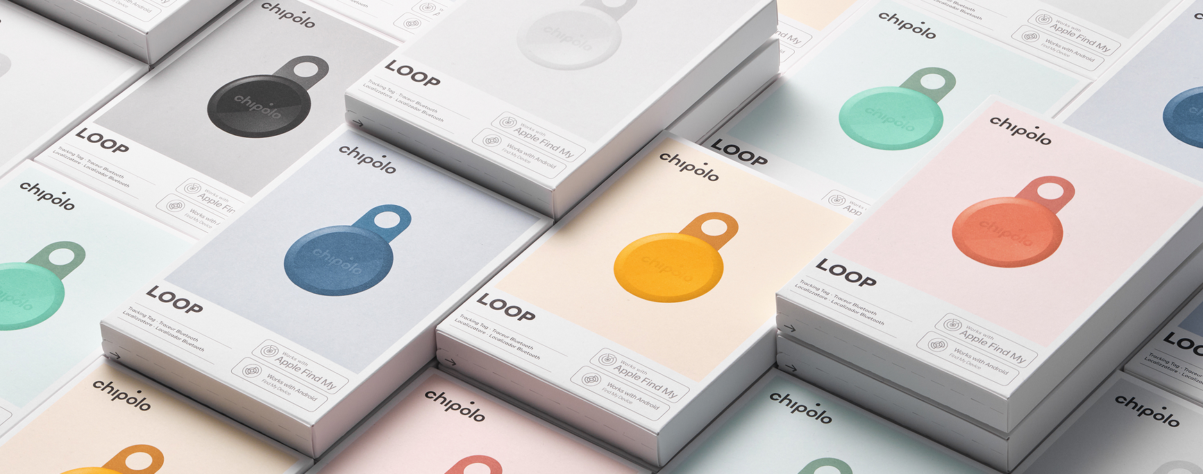
The new creative direction explores sustainability of smart tech objects: new products are made from at least 50% post-consumer recycled plastic and produced locally to further reduce our footprint.
A lot of thought went into the modular packaging, made from uncoated, FSC-certified paper and printed with mineral-oil–free ink. The compact format of Chipolo’s new packaging uses as little material as possible, which also means lighter, cleaner, and more efficient shipping.
- No embossing
- No metal clips
- Loose paper sheets to reduce waste and avoid component separation
The long-term impact
Branding is notoriously hard to measure (too many moving pieces, market unpredictability), yet, here are 5 key business benefits that Chipolo achieved through its rebranding, refreshed packaging, and strategic shift toward a lifestyle brand focused on living life to the fullest:
- Premium Positioning elevated perceived value, supporting higher margins and price points above generic competitors
- Modern, sustainable packaging boosts retail conversion and drives organic word-of-mouth sharing.
- Sleek lifestyle design unlocked co-branding and placement in premium retail channels.
- Positioned as a proactive everyday companion, an 'emotional gadget', Chipolo now drives long-term brand affinity beyond mere lost-item tracking.
- A distinct European design identity creates a defensible moat against low-cost Amazon alternatives.
- As Chipolo's brand matured, it became strong enough to support partnerships with global technology and lifestyle brands, including Apple, Google and Mercedes.
A strong brand isn’t a one-off project.
It’s a living relationship.

Branding is always a team effort!
Chipolo Design & Marketing Team:
Domen Barovič (CDO), Nika Kramžar (CMO), Jaša Kofol, Maša Škrinjar, Žan Pavšek, Darja Kodrič, Nina Korelc, Petra Mezek
Photography: Lovro Rozina